Back to journal

Family wellness / May 2026 / 3 min read

Why kids wellness needs design parents trust instantly

Parents do not buy into kids supplements for fun packaging alone. They buy when the product looks friendly, the benefits are legible, and the brand feels trustworthy in seconds. That is why the OTG kids lane needs its own thoughtful tone.

OTG Grow Pop kids multivitamin gummies product panel

Parents scan before they read

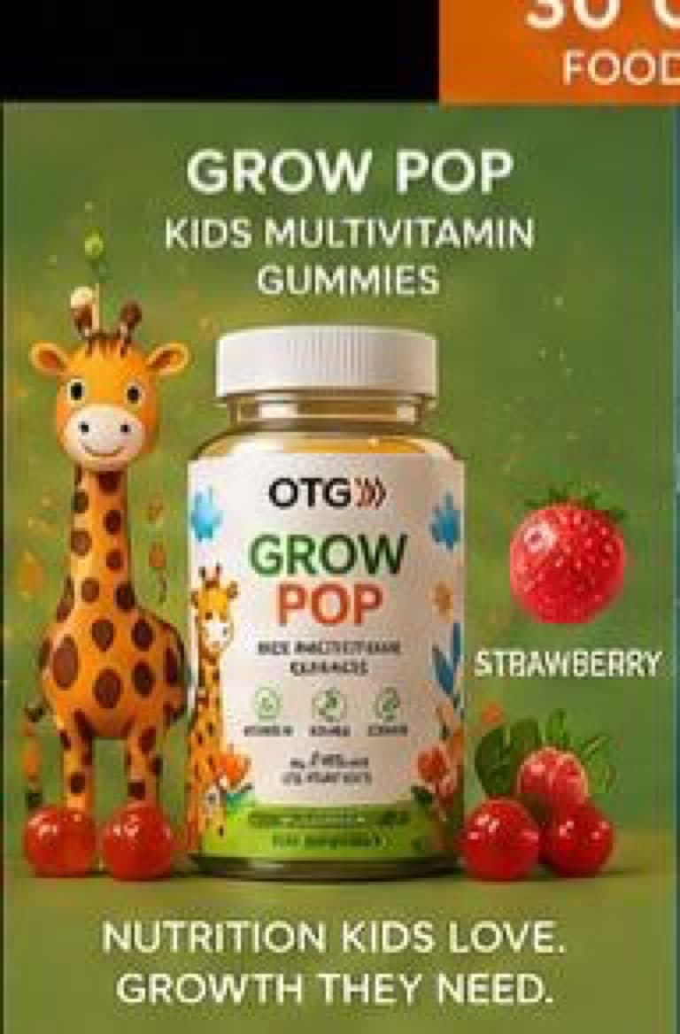
Grow Pop has strong instinctive signals already: the giraffe character, fruit, and bright palette all say approachable family wellness quickly.

The website should keep that speed while still sounding premium and calm enough for an adult buyer.

The tone should be warm, not childish

A good kids wellness page speaks to the parent as the decision-maker. It should feel easy, reassuring, and routine-friendly without sounding clinical.

That is where OTG can differentiate from either overly medical family brands or noisy candy-like competitors.

Range design makes the product feel safer

When Grow Pop sits inside a clearly designed OTG portfolio, it borrows trust from the full brand system rather than feeling like a random kids SKU.

That matters for conversion because it helps the entire storefront feel more intentional.