Back to journal

Ecommerce UX / May 2026 / 5 min read

How to build a range page that actually sells

Many supplement sites try to sell one abstract lifestyle instead of showing the actual product family. OTG works better when the customer sees the lineup quickly and understands how each product owns a specific wellness lane.

OTG product family hero lineup

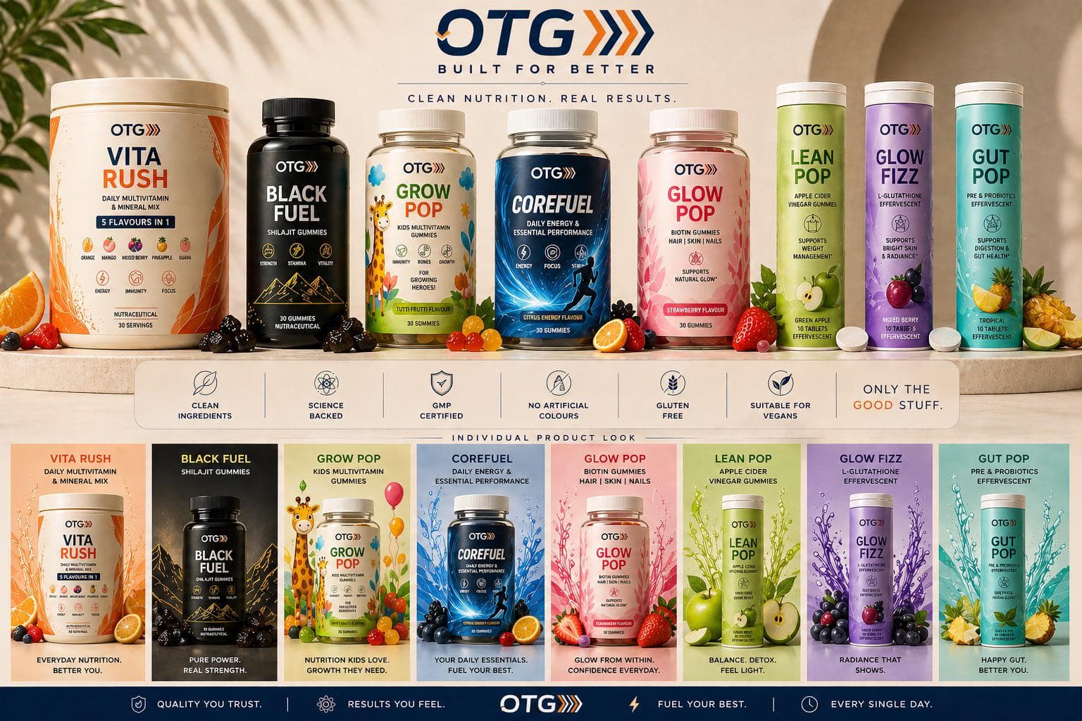
The range should do more of the selling

When the customer sees the full family early, the brand immediately feels more legitimate. A range page can make even newer products feel more trustworthy.

That is especially important for OTG because the colour system across hydration, energy, beauty, and gut support is already visually distinctive.

Category contrast makes browsing easier

Orange, black, blue, pink, purple, and green are not just aesthetic choices. They help the customer sort the range mentally.

That means the site should preserve strong product separation instead of flattening everything into one neutral card system.

Conversion gets easier when choice feels guided

The best range pages let customers move from one hero product to a complementary bundle or related routine without feeling lost.

That is why OTG benefits from product-led cards, stronger bundle logic, and benefit-based navigation.